Logo Design - Vote For Your Favourite

Which one do you prefer ?


  • Total voters
    8
  • Poll closed .

sil3ntr

Motoflogger
Hey everyone, playing around with some logo designs. I personally like flat design hence thats the style I am going for.

RR is short for RichieRides, the bottom left (1) was modelled off of CBR's RR, the right bottom(2) is a nicer rounded interpretation of the same thing and the top centre (3) is a simpler looking RR.

Let me know which you "personally" prefer ?

Thanks in advance.

Screen Shot 2017-02-06 at 8.17.39 pm.png
 
I like the bottom right font but would be better larger and possibly stacked a bit like the other one.
Would be interesting to see the bottom of the R on the one above to link with the top of the one below. (Hard to describe :()

Yep, I understand what you mean, ill see how it looks. Cheers
 
Personal preference i'm more partial to the bottom two as they're a more eye catching font.
I voted bottom left because it's a nice simple reference to your CBR F1 haha!

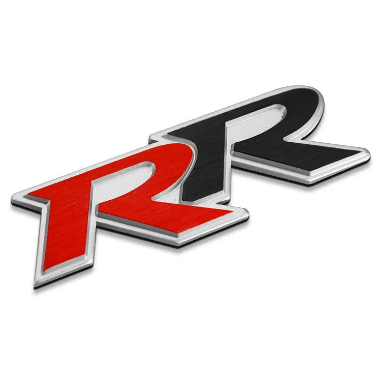
To throw in an idea, I did a search on RR logos and I quite liked this one too.

-font-b-Black-b-font-Red-Double-R-RR-Thick-Aluminum-Alloy-Zinc-Alloy-Car.jpg
 
Yeah, that's a good place to start. (Can't copy exactly)
Bottom left is modelled off the current Honda RR logo. Dray that RR you picked out it from the Honda Civic. don't mind the shape but obviously in a flat design style, 3D font makes me sick ;)

I'll have a play and see what it looks like, personally I am leaning bottom right. I just mocked it up with larger R's and with them connected diagonally (similar to what EDcase suggested) looks ok.
 

Winners Video

Website Supported by Ipswich SEO

Latest posts

Back
Top